What is Wrong with your Landing Page & how to Fix it
A landing page should never be “just another page” in your website; it is, after all, a source of leads and, consequently, a source of money, so you should treat it accordingly. Unfortunately, too many people forget about that and rush to hit “Publish” on bad landing pages that will never bring in quality leads and that, even worse, can drive people away from the website altogether. Let’s take a look at the most common landing page mistakes and find out how to avoid them:
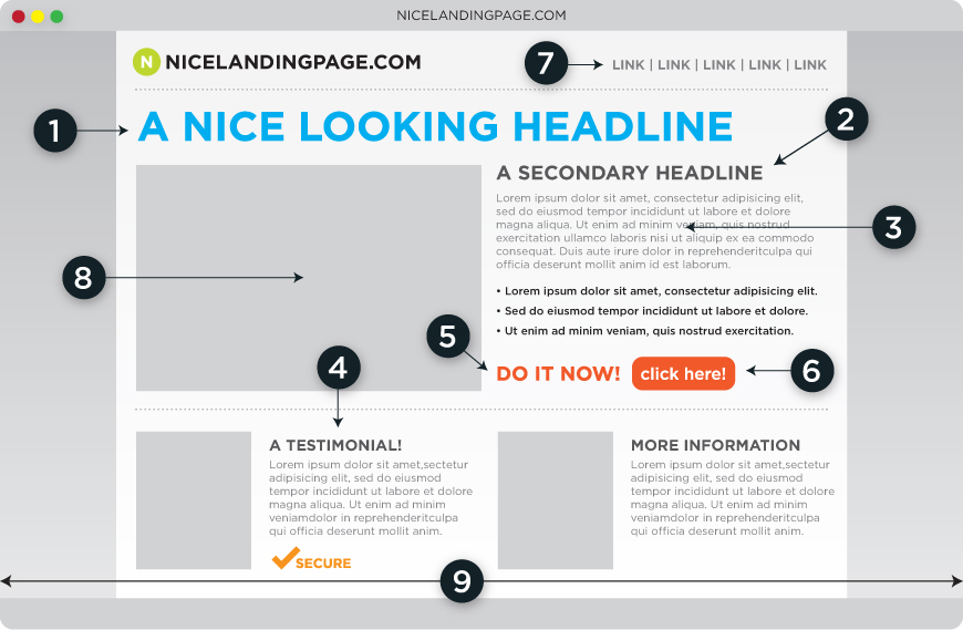
Mistake #1: Your landing page doesn’t have a clear goal
When you start designing and writing the content for your landing page you should have a single goal in mind and a single product to advertise. Sure, all of your products may be interesting, but, remember, readers lose focus quickly, so don’t overwhelm them. Make it short and to the point; list the benefits and invite them to act using a clear call-to-action (CTA) that is visible and in accordance with the rest of the text.
Mistake #2: You lose sight of the context
In general, a landing page is part of a sales funnel. In other words, your prospective lead gets to it by clicking on an ad from Google, Facebook or any other CPC or similar ad network. When you build this sales funnel, make sure it’s consistent; the text in the landing page needs to “close” the deal that the ad started. For instance, if your ad speaks about a shoe wholesale and has a picture of high-heeled shoes in it, those shoes should be on your landing page. Never lure customers in with false promises!
Mistake #3: Too many options
Think about your goal again; what is it? Should people BUY something, DOWNLOAD something or fill in a CONTACT form? Whatever it is, this should be the most highlighted portion of your landing page. If you are selling shoes, your BUY button should be clearly visible everywhere on the page. Other options, like contact or “find out more” should be at the bottom of the page, just in case someone needs extra clarifications (but if too many people do, your page is not doing its job right!).
Mistake #4: Your CTA button is in the wrong color
Yes, we all have brand guidelines that we need to abide by and color usage is one of the most important things there. But sometimes the colors of your brand are not the best ones to use for a CTA button on a landing page. Here are some color options that inspire trust and convey to people that it’s safe to shop here:
- Blue – this is a color that works well for both men and women and it is usually associated with a trustworthy environment. Perfect setting for shopping, right?
- Green – green is ideal for budget-aware people. So, if you have great prices or discounts and you want to emphasize on that, always go with green.
- Purple – this color is women’s favorite; on the other hand, most men react badly to it. So, if your audience is primarily made of women, this is the way to go.
There is more than the above statistics to choosing the right color. Take into account the rest of the palette you are using on your landing page and make sure that the CTA button contrasts with it. This is how you make it stand out!
Still don’t know whats wrong with your landing page and how to make the most of it? We can help! Click the button below and you’ll be one step closer to boosting your business through extra leads:
Get more conversions
[/mk_button]
Photo source: formstack.com
1 Comentariu la “What is Wrong with your Landing Page & how to Fix it”
[…] perfect landing pages in place. We run tests together, we create alternative copy, we fix obvious mistakes and so […]