How to Create a Website Conversion Funnel that Will Boost Your Profits

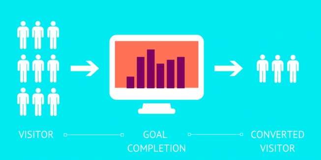
Getting new leads or converting existing ones without a coherent website conversion funnel is next to impossible. Luckily, creating one isn’t all that tricky. In fact, all that you need are fives easy steps to guide your visitors through the process:
- A call-to-action
- A well-written landing page
- A registration or contact form
- A thank you page
- A confirmation email
Let’s see how all this can come together:
-
The CTAs that Entice People to Click on Your Link
A call-to-action (or CTA) is a button with a short phrase that entices people to take action. Your CTAs can appear on your website, directing people to a specific page or in an ad. When you create your CTAs, the first thing you need to keep in mind is that they have to be action-oriented and create a sense of urgency. Use no more than 5 words and keep it to the point: “Download your free guide now”, “Sign up for the newsletter”, “Contact us”, Shop now at a discount”.
When designing the CTA button, make sure to use contrasting colors so that it really stands out. You can also use pop-ups, but never make them too intrusive. Furthermore, place your CTA in a visible and relevant manner.
-
The Landing Page
The landing page is what people see immediately after clicking on the CTA button. This is why it should always be relevant – if your CTA says “Download your free guide now”, the landing page should be about nothing else than that guide.
Start your landing page with a headline that describes your value proposition: “Our guide can help you double your profits through Facebook Ads” – this headline tells the reader exactly what to expect. Moving on, describe your offer in greater detail. In this case, you can enlarge upon every chapter in your guide’s table of contents, for instance and, obviously, explain why they are all relevant.
A landing page should treat one subject and one subject alone. If you want your readers to download the guide, speak of nothing else here and give them easy access to the download button. Ideally, you should also remove your website’s top menu in order to avoid distracting the user who, in turn, might leave your website conversion funnel.
Even though written content should be your first concern, don’t forget to add a graph, an image or an infographic – visual content is often more easy to grasp and keeps your reader focused.
-
The Contact Form
Include a contact form on your landing page, as high as possible so that it is immediately visible – some people may have already decided they want to download your guide. If they don’t need to read the content, why make them scroll all the way down?
It might be tempting to add as many fields in your contact form, but try to refrain. People are skeptical about giving away too much personal information, so stick to what you absolutely need for your website conversion funnel: name, email, phone number, job title and company (ordered by importance; start cutting from the end).
-
The Thank-You Page
Keep this one as short and sweet as possible. Obviously, you want to thank your new leads for the choice they made, but there’s no reason to reiterate everything in your landing page. If a user has gotten so far, it means that your website conversion funnel is working.
Briefly put, you need to thank them, re-ensure them they made the right choice and follow-up with a new offer. “Thanks for downloading our guide! You are now on the right path to doubling your revenue, congratulations! You might also be interested in our newest e-book about Facebook Ads.” Of course, you can enlarge upon your upsell offer, but try not to make this the highlight of your thank you page. Instead, place social sharing icons in a visible place – some of your leads friends may want to benefit from the offer, as well.
-
The Confirmation Email
This is the final step of your website conversion funnel: send your new leads an email with the download link or confirmation of subscription. The most important thing here is to make sure the email is personalised. At the very least, use their name. But, if you asked for a lot of information in your contact form, try to include some of that, as well, in order to really let them know you value your new relationship.
Need help creating your own successful website conversion funnel? You’ve come to the right place. Get in touch and we’ll be happy to help you.


1 Comentariu la “How to Create a Website Conversion Funnel that Will Boost Your Profits”
[…] to 40% is great. This means everything is working perfectly on your website and your conversion funnel is spot […]