How to Get a High Converting Home Page – the Complete Guide

A recent report shows that companies who have a structured approach on conversion optimization are twice as likely to see a significant increase in their sales.
You’d think that heavy testing is the key to a high converting home page and that people would act accordingly. But they don’t. It turns out that only 39% of companies do more than 5 tests per month.
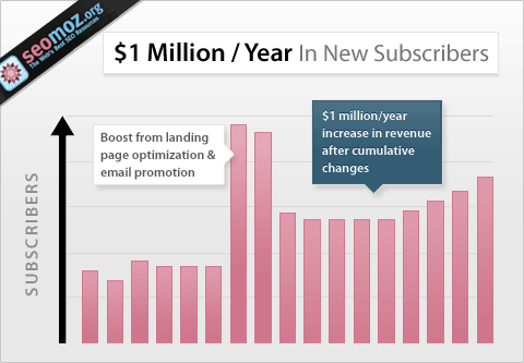
Conversion Rate Experts managed to bring in an additional $1 million in revenue for Moz through email marketing and landing page optimization. Of course, a lot of testing was also involved.
The vast majority of Idunn’s clients are quite focused on having perfect landing pages in place. We run tests together, we create alternative copy, we fix obvious mistakes and so on.
While I always advocate for having a dedicated landing page for each of your products or services, it’s important to note that the home page needs special attention, too. In fact, companies that sell a single service or product or that have a main product they want to promote can gain more from having a high converting home page than ten other landing pages.
Let’s see how you can get there.
Why Having a High Converting Home Page Matters
Oftentimes, your home page is where most visitors land. If it cluttered, crowded or hard to read they won’t bother moving to another one. No, not even to your carefully crafted landing page.
The amount of thought, planning and testing you put into your home page also has an impact on your brand. The conversion elements you add have to match your brand identity and offer the visitor a seamless experience. Of course, this is easier said than done (but aren’t most good things?).
Marketers and web designers often say that websites have replaced old-school, paper business cards. When someone wants to learn something about you or your business, they go to your website. But most notably, they go to your home page.
Even if you hire the best SEO copywriters in the world to craft perfect blog posts that bring in tons of leads, do you know what will those leads to before they even consider becoming customers? That’s right – they will leave your blog and visit your home page.
So give them what they are looking for – assurance that they’re on their way to make a great deal. Here’s how:
The Complete Guide to a High Converting Home Page
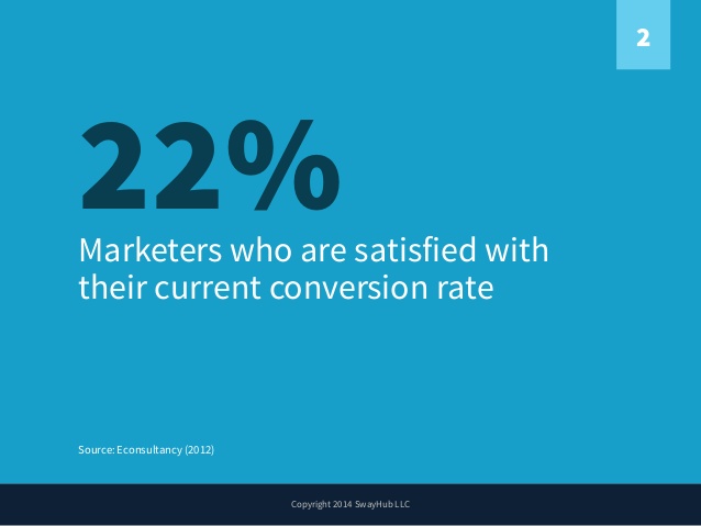
While the average conversion rate differs according to industry and medium, we can all agree that marketers’ number one priority is to increase it. It turns out that only 22% of marketers are happy with their current conversion rate.
Image via Econsultancy
Sadly, having a high converting landing page isn’t as easy as changing colors or CTAs. Every element has to be flawless, so let’s take a look at them:
-
Keep it Simple
The most common mistake that usually kills an otherwise high converting home page is cramming too much information and too many messages into it. I understand it. You want to tell people about the benefits, you want to offer stats, proof AND a bit about yourself.
But you don’t need to.
Not here anyway.
The only thing you need to do on your home page is give people a strong reason to click on your CTA button.
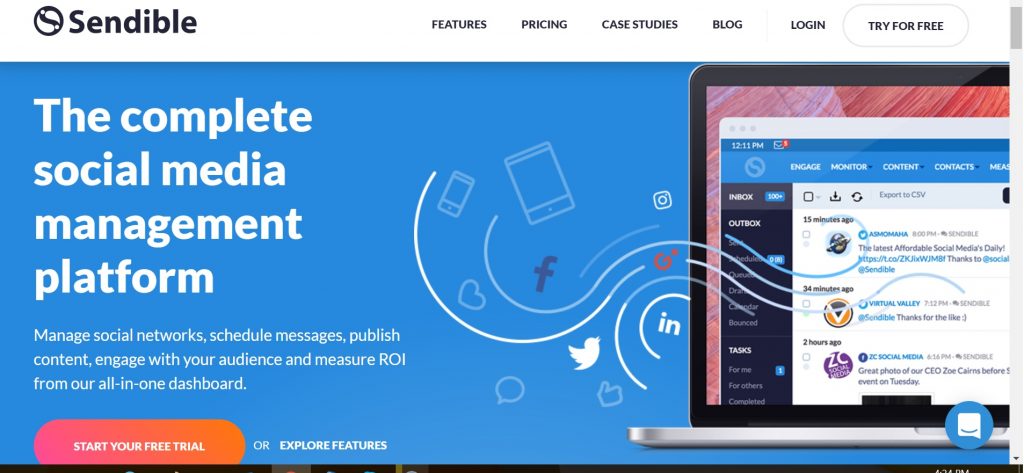
Look at what others are doing: Sendible gives the briefest definition of their service.
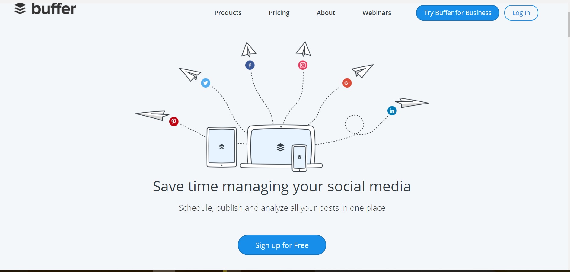
Buffer gives you one of the most compelling reasons for SaaS clients: time saving.
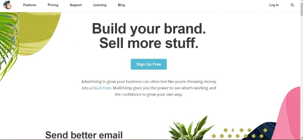
MailChimp ups the stake by promising to help you sell more.
Of course, if you scroll down further you will see more info: each of these companies details how they go about fulfilling the promise in their principle message. They also offer social proof and guarantees. But only after they’ve caught your eye with a powerful message.
Which brings me to the second item on this list.
-
Craft a Powerful and Simple Message
“Sell more”, “Save time” – this is the kind of simplicity you should be aiming for. Look at the MailChimp home page – it doesn’t get any simpler than that. The background is all-white, which makes the message all the more powerful.
Most of the clients Idunn worked with on re-doing home pages had one mistake in common: they had trouble identifying the main advantage their service of product offers. Once you’ve done that, you know what you have to do.
I know the temptation of saying more is big. After all, the more advantages you list, the better the chances that more potential clients respond to one of them, right?
Right, but this can lead to loss of attention, too.
If your key message is powerful enough, it is all that you need. Plus, you have plenty of room on your website to list them all. You can also list them on your home page, but lower.
Always leave the spotlight on a single powerful message!
-
Allow for White Space
You don’t have to fill every pixel on your readers’ screens with information or buttons. Allow for some white, unused space.
Contrary to its name (“unused space”), this is actually very useful. It allows people to read the copy easily without having to squint or without having to choose between lengthy paragraphs.
-
Make it about “Them”
Resist the temptation to brag about you at all costs. As in the examples above, a high converting home page is about the user. They “sell more”, they “save time”, they “can’t pass up an amazing deal”.
By shifting focus, you make them feel welcome in your own virtual home. Plus, it allows readers a chance to image how their life or business could change with you in it.
The same principle is valid for both the CTA and the headline. They should all focus on the same benefit: “You can sell more – Register and get more revenue”. This is the type of duo that sells!
-
Add the Essential Elements of Trust
Have you been featured on one or more huge media outlets like Forbes, Entrepreneur, Washington Post, Huffington Post and so on? Add a block with all the logos on your home page.
Do you offer secure payment and various payment options? Add the relevant logos to the home page.
Do you have clients who are raving about your product? Create testimonials and add (you’ve guessed it!) add them to your home page.
Social proof – snippets of reviews of your products on platforms like Yelp or social media networks should also find their way on your high converting home page.
Bottom line: whatever boost trust that your product is used successfully by others and that your online reputation is stellar should be on your home page. However, make sure you add all these lower – you don’t want to draw attention from your main message.
-
Test Your Loading Speed
Nothing kills the desire to learn more about a company and its products than poor loading speed. You can test yours here.
The main reason why home pages tend to load too slowly is too much JavaScript code crammed into a single page. Again, this stems from a desire to add too much info, widgets and visuals to your home page.
Yes, having a video is great, but not if it adds an extra second to your loading speed – yes, a second is a huge amount of time in the mobile era!
If your loading test has unsatisfactory results, contact your web designer/web master right away. The problem can be easily fixed by a savvy web developer.
No matter how strong your message and how powerful your visuals, very few people will have the patience to suffer through poor load time just to get to them.
-
Test, Test and then Test some more
Don’t settle for running an A/B test when you first change your home page. Do it constantly. The stats I cited above say that only 39% of marketers do more than five tests in a month. This is your chance to be among the few.
Ongoing testing should be the norm. Why? Because you will constantly change your PPC ads, you will have new social media followers and new people who visit your high converting home page. Add that to the fact that people’s preferences are constantly changing and you’ll see why continuous testing is an absolute must.
Any small drop in your conversion rate is a sign that you should keep an eye on your home page. Yes, the drop may be influenced by a lot of things that are harmless and out of your hands, like public holidays, but this is not a reason for you to stop searching for reasons that you can control.
Start Building Your High Converting Home Page
Having a strong, high converting home page is no reason to let the other landing pages on your website go. They should all be working together.
The last element you should focus on is telling a coherent story on your website. Your home page and every other landing page should be part of the same story, a story that helps readers move forward in their buyer journey.
Need help building a high converting home page? Get it from specialists that are HubSpot-certified in creating content that turns visitors into paying customers:

